Get in touch
555-555-5555
mymail@mailservice.com

Brand Story:
The Art of Seed-to-Table Innovation❌
About SEED by Farmacy: A Green Tech Culinary Revolution
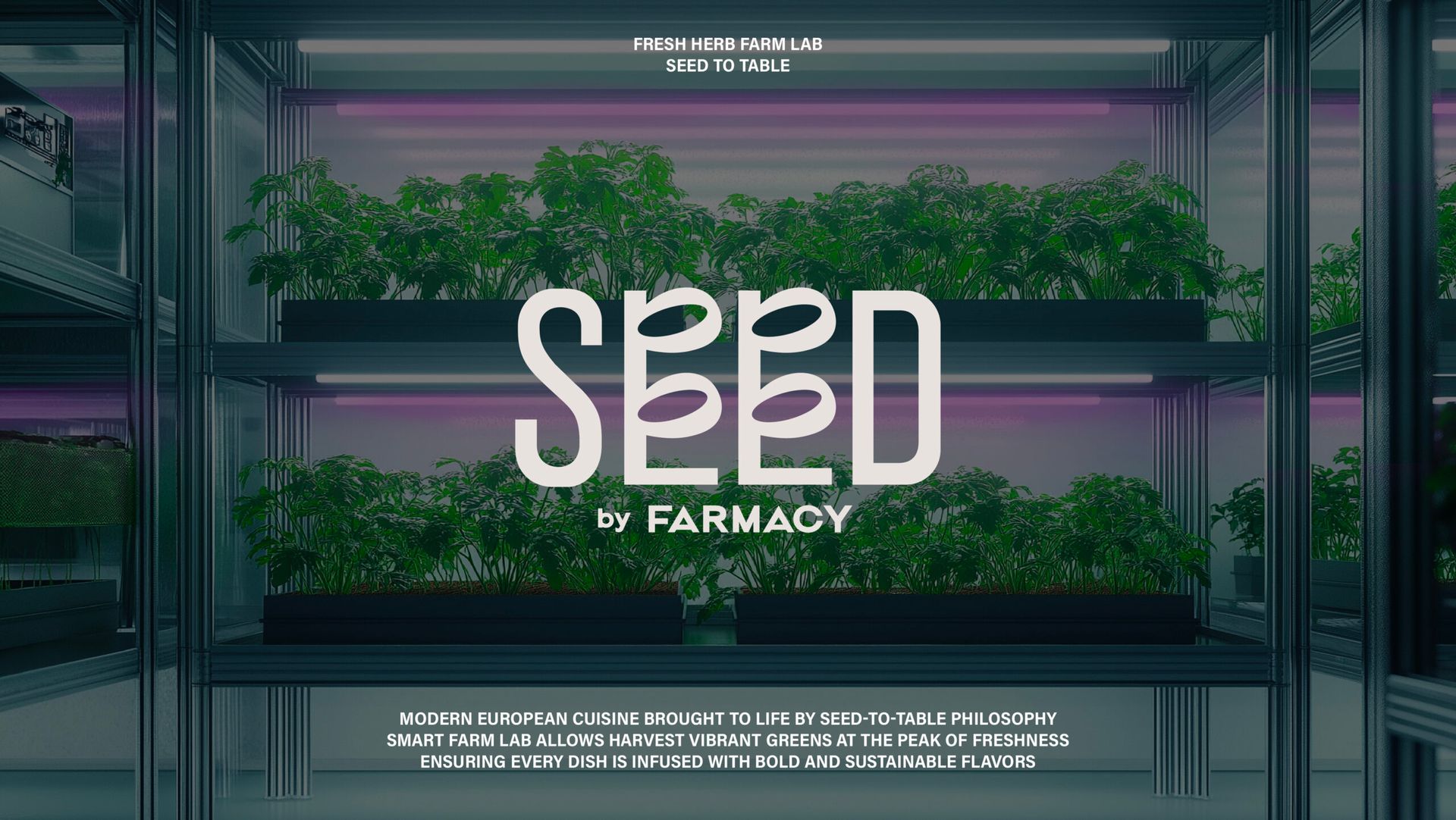
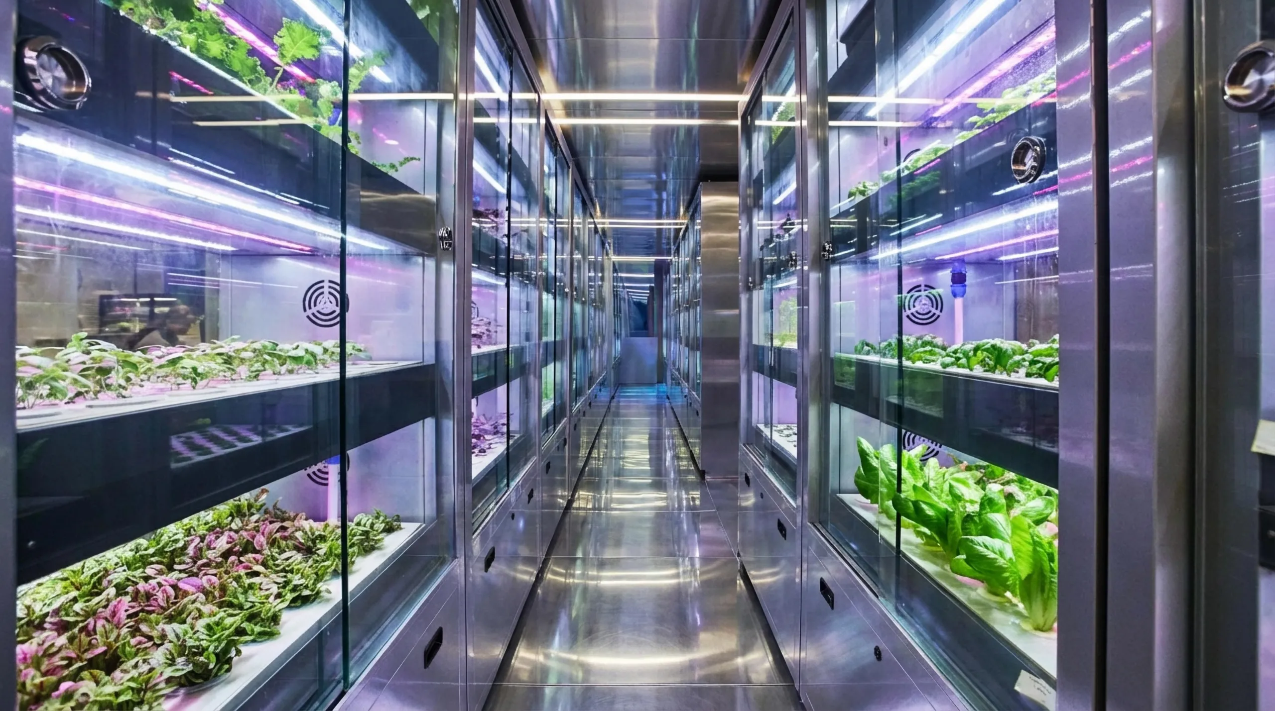
Located in Cyberport, SEED by Farmacy redefines modern European cuisine through a “seed-to-table” philosophy. By integrating Farmacy’s signature smart-farming technology directly into the space, SEED serves vibrant, sustainably harvested produce. Vincdesign led the branding and repositioning, bridging the gap between AgTech and everyday dining to create a friendly, accessible identity. The result is a brand that balances cutting-edge innovation with the soul of hand-crafted culinary artistry.
Discovery|Project Discovery & Brand Insight
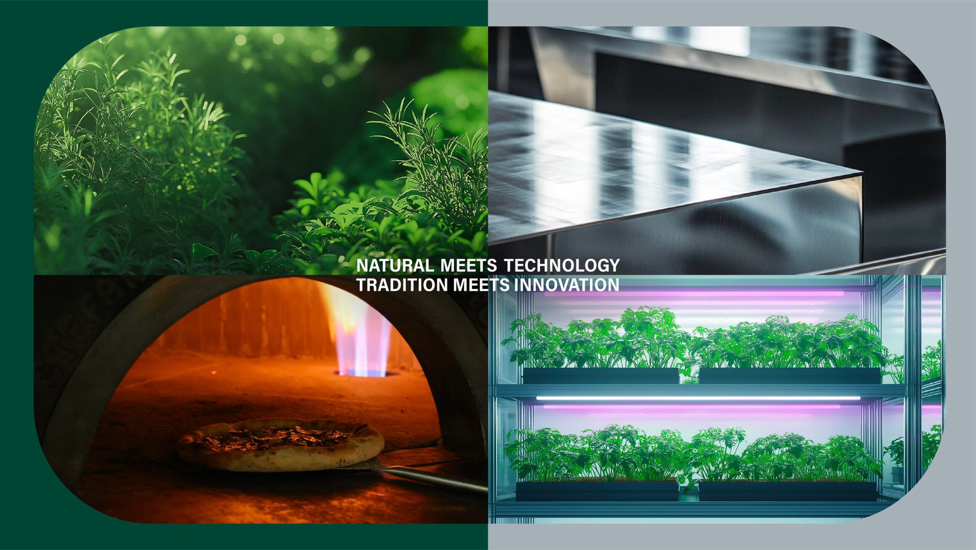
The branding and strategic evolution of SEED by Farmacy began with a deep exploration of how to translate Farmacy’s technological DNA into a premium culinary identity. While Farmacy established itself as a leader in green technology through smart mobile farms, its original visual identity was primarily functional and lacked the sensory appeal necessary for a high-end dining brand. Our primary challenge lay in maintaining this “Green Tech” professional image while simultaneously projecting an appetizing and delicious persona. We discovered through our research that while the audience highly valued sustainability, they were ultimately drawn to the “freshness” and “human touch” of the food. Therefore, the insight for this project was to position the brand at the intersection of innovative technology and lifestyle aesthetics, effectively breaking the stereotype that technology in food is inherently cold or clinical.
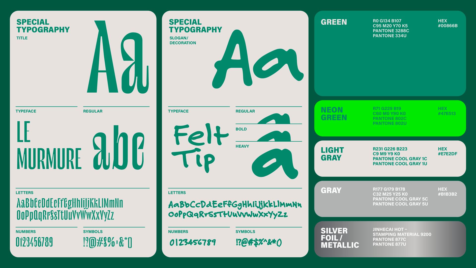
Strategy|Design Strategy & Creative Narrative
The design strategy focused on the narrative of “Seed to Table,” aiming to bridge the gap between cold green technology and the warmth of a modern European bistro. To achieve this, the color palette was shifted to a sophisticated pairing of silver and vibrant green. The silver represents the sleek, futuristic essence of the Smart Farm Lab and Farmacy’s green-tech origins, while the green symbolizes the vitality of fresh herbs and the unique flavor advantages of on-site harvesting. This narrative ensures that the brand remains rooted in technology while emphasizing the sensory delight of fresh produce. By positioning the “Mobile Farm” as a core USP (Unique Selling Point), the strategy successfully framed SEED as the ultimate destination where innovation directly enhances the quality of every bite.
Identity|Visual Identity & Aesthetic Craftsmanship
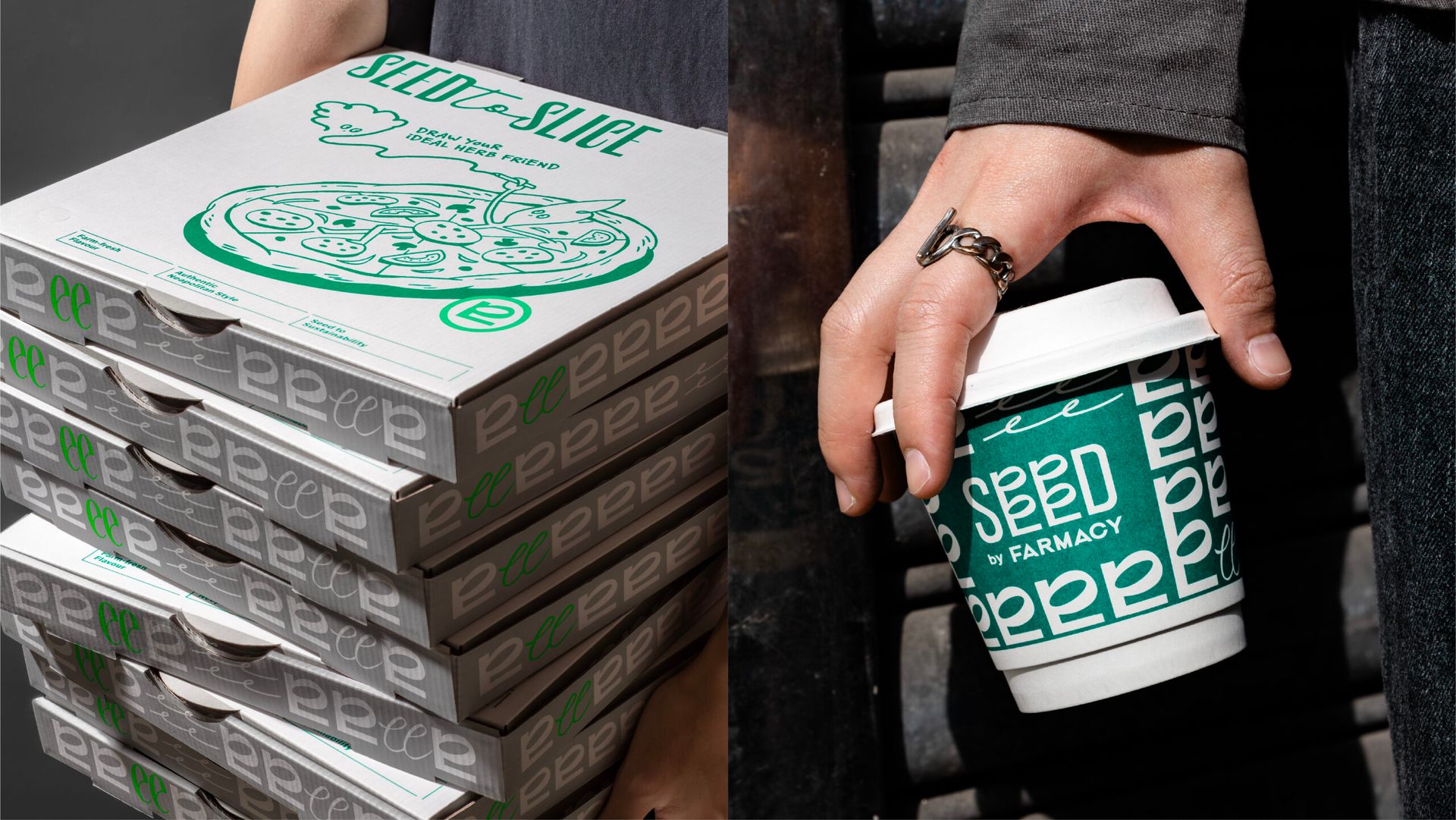
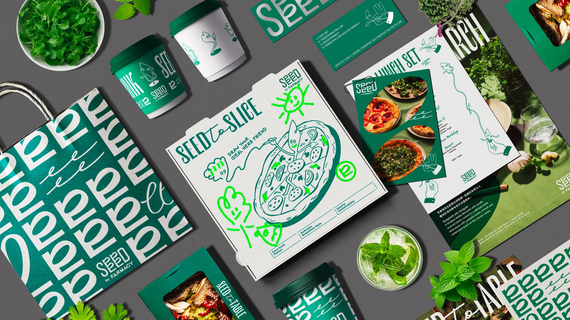
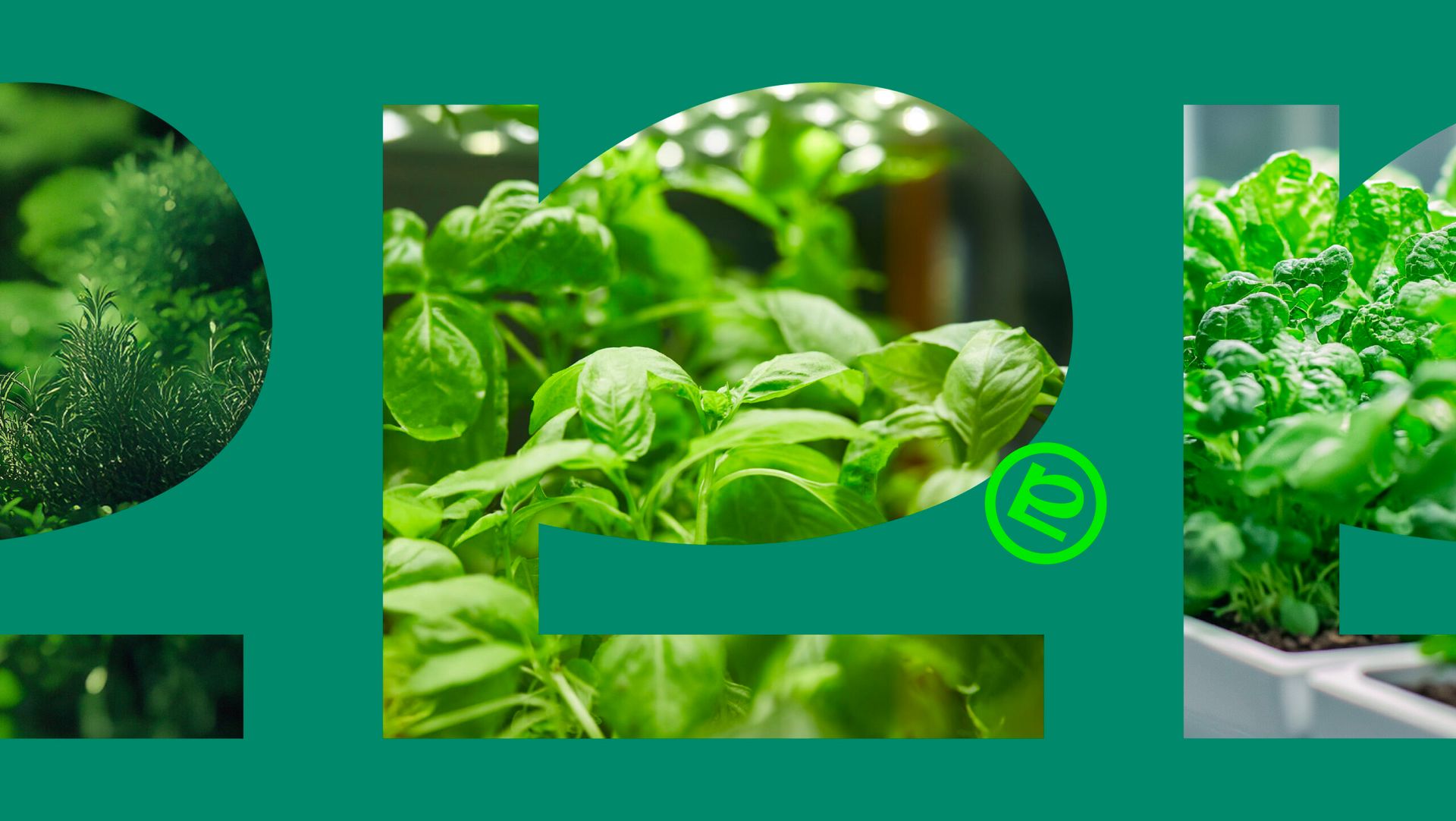
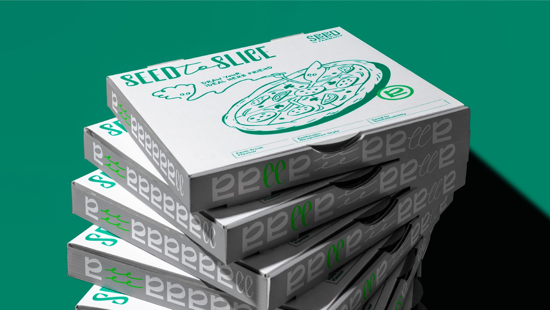
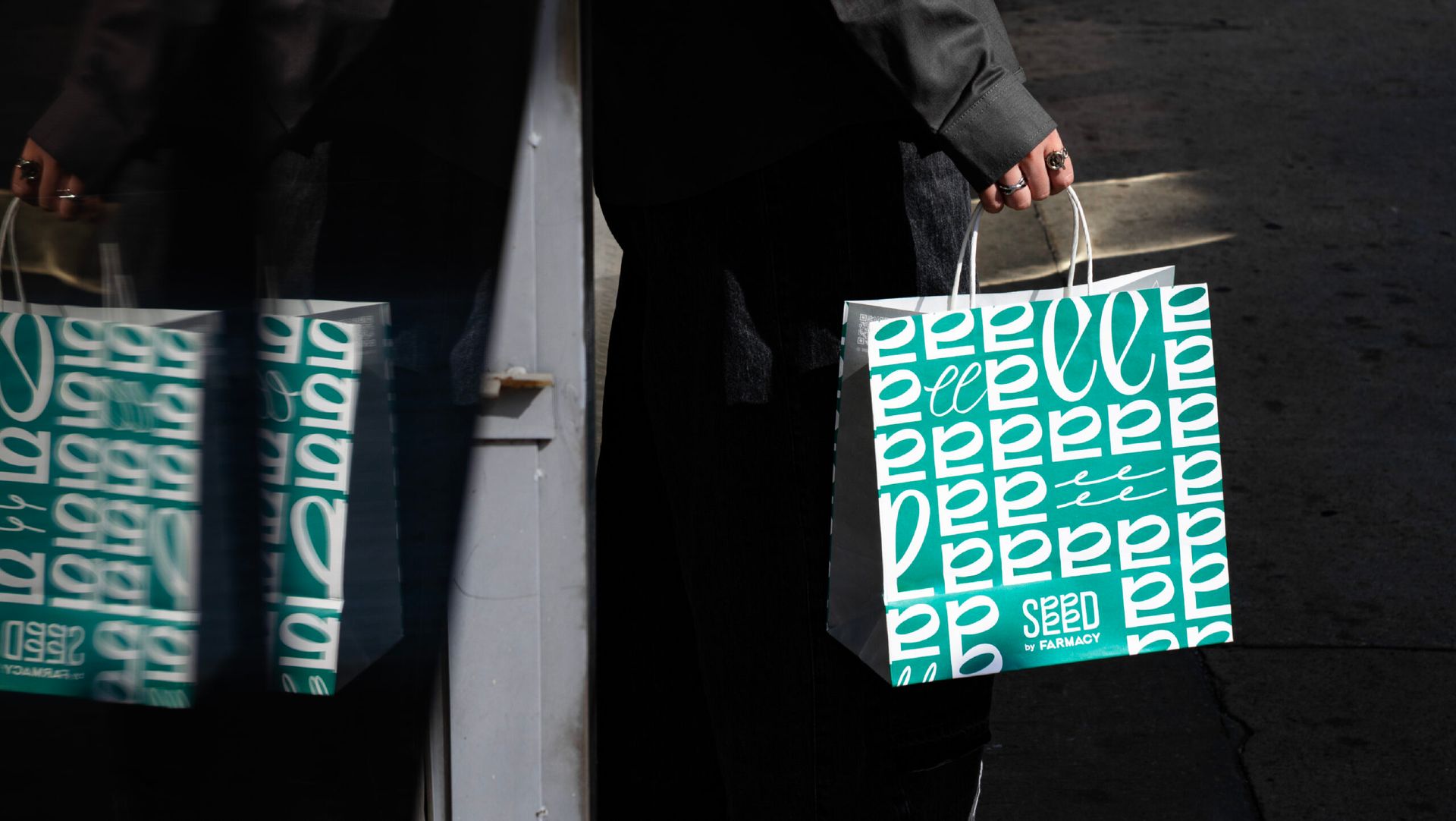
Aesthetic craftsmanship took center stage in the development of the visual identity. The letter “E” in the SEED logo was meticulously designed to serve as a microcosm of the mobile farm, symbolizing sustainability and the distinct advantage of ultra-fresh herb cultivation. Both uppercase “E” and lowercase “e” serve as the primary typographic building blocks for the brand’s visual language, arranged into modern, rhythmic patterns that define the brand’s stationery and collateral. To balance the inherent coldness of technology, the character of “Mr. Seed” was introduced—a whimsical, relaxed herb figure that injects humor and a human touch into the identity. The key visual features a classic Italian “mamma mia” hand gesture holding Mr. Seed, a witty and memorable fusion of traditional culinary passion and modern herb-centric innovation.
Rollout|Implementation & Brand Experience
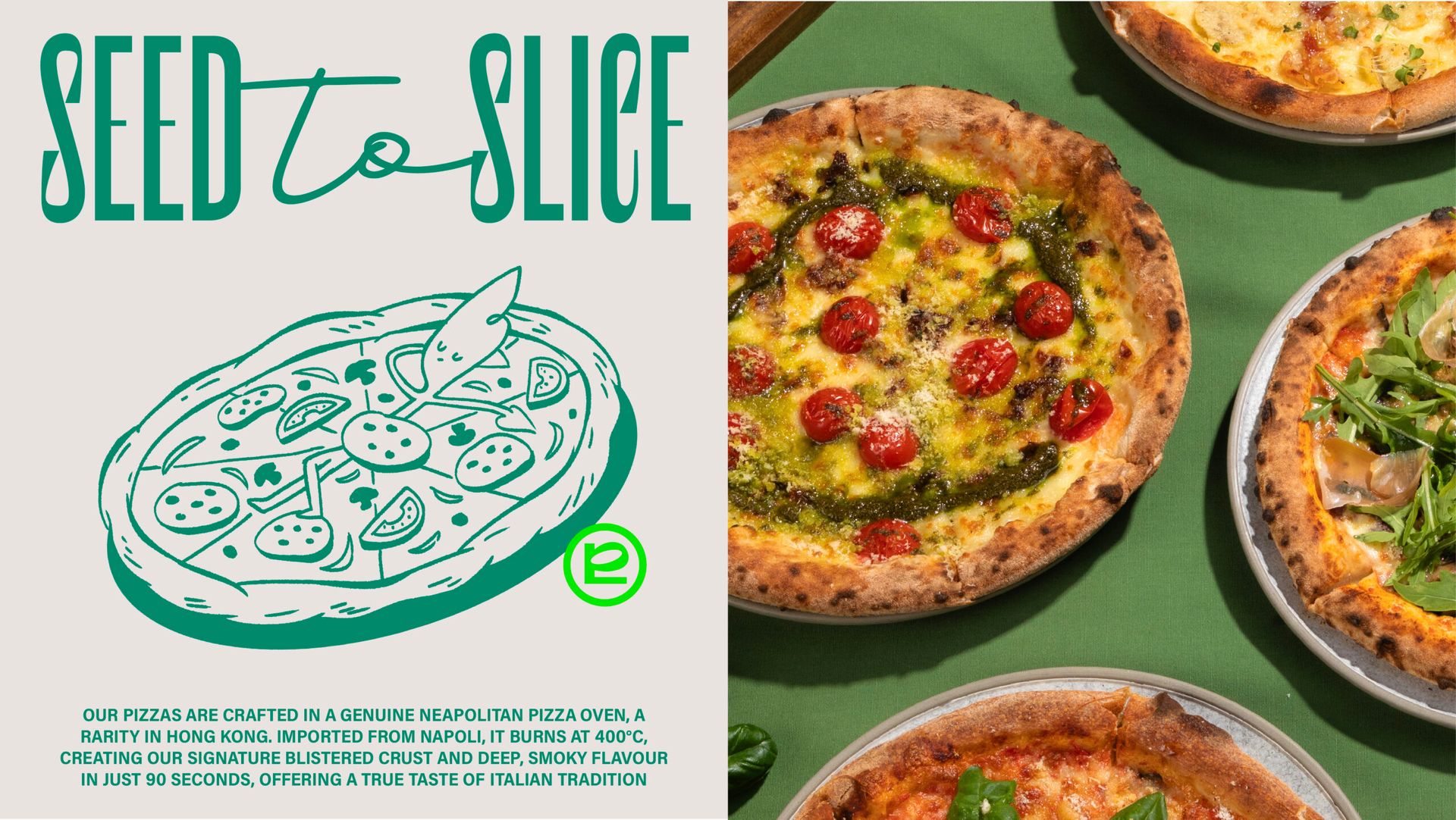
The branding experience is rolled out through a series of touchpoints that emphasize a relaxed, trendy, and lifestyle-oriented atmosphere. The menu is presented in a magazine-style format, projecting a sense of casual elegance and fashion that invites diners to engage with the brand’s story. Mr. Seed is a ubiquitous presence throughout the restaurant, appearing on packaging and collateral to playfully remind guests of the fresh ingredients accompanying every dish. This experience is anchored by the restaurant’s authentic heart: a specialized pizza oven imported from Italy that produces traditional, high-quality flavors. By pairing every hand-crafted dish with herbs grown just steps away in the Farmacy lab, the rollout successfully created a stable brand image that has attracted a loyal fan base and generated immense positive feedback, effectively merging green tech with the local community.


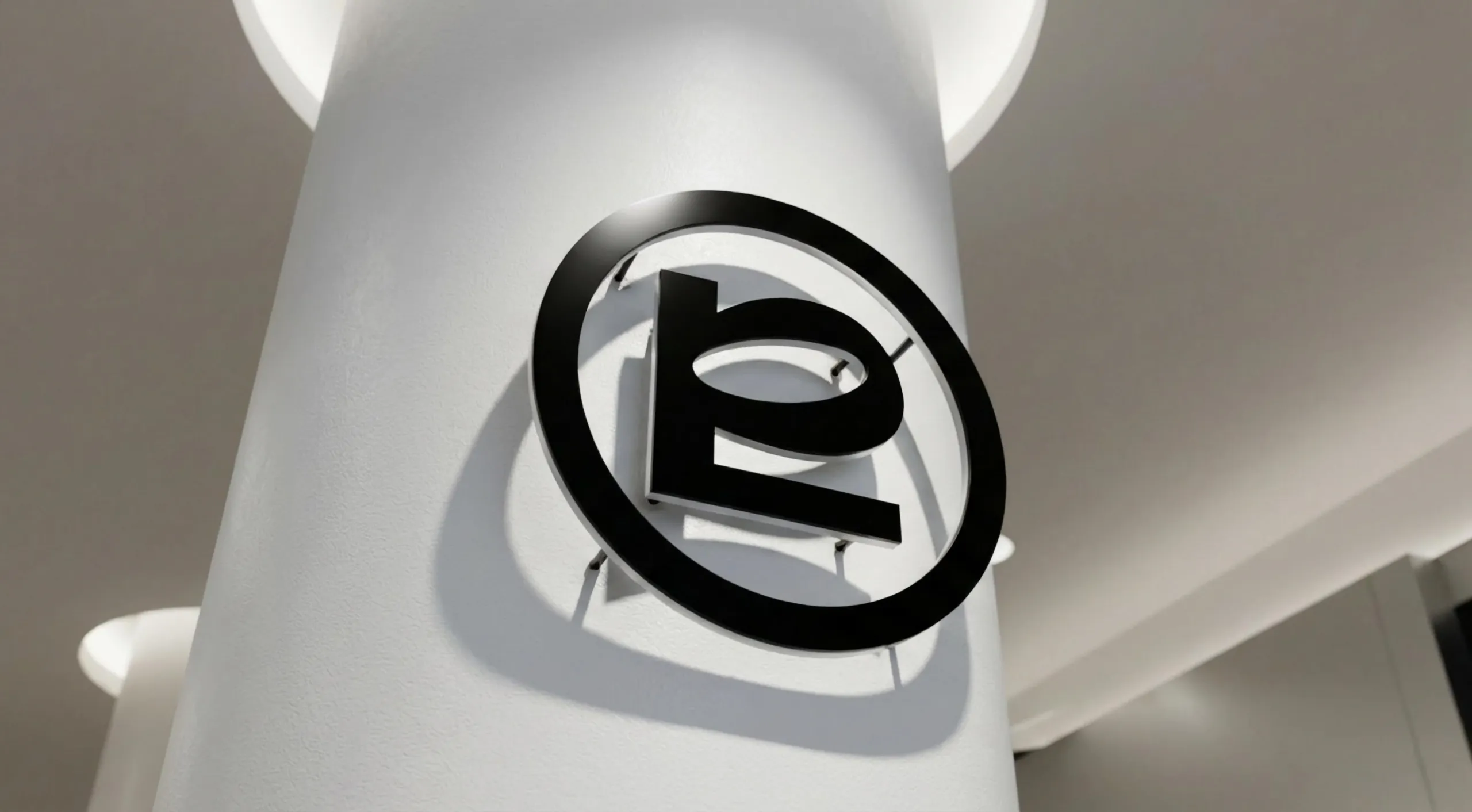


The letter “E” in the SEED logo was designed as a microcosm of a mobile farm, symbolizing both sustainability and the peak freshness of on-site harvesting. This typographic element, alongside the lowercase “e,” serves as a recurring visual motif used in modern typographic patterns that define the brand’s visual language.
The letter “E” in the SEED logo was designed as a microcosm of a mobile farm, symbolizing both sustainability and the peak freshness of on-site harvesting. This typographic element, alongside the lowercase “e,” serves as a recurring visual motif used in modern typographic patterns that define the brand’s visual language.
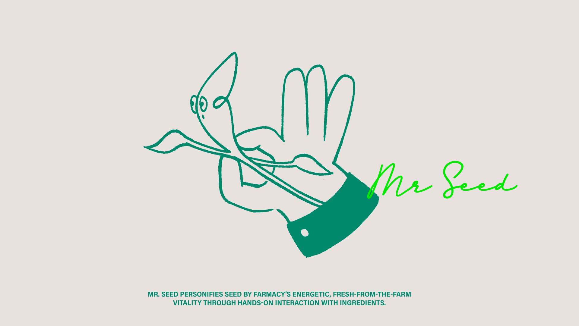
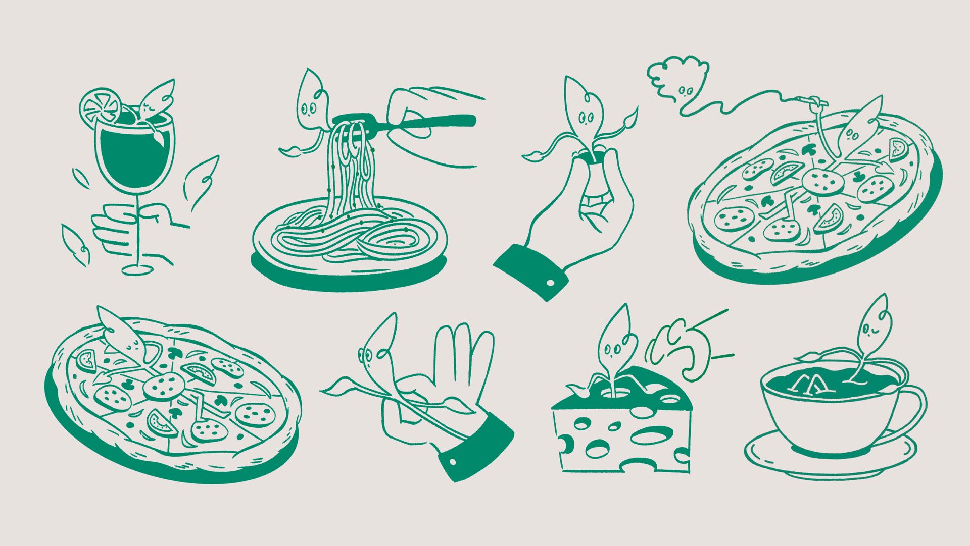
To balance the technological precision, we introduced “Mr. Seed”—a whimsical, hand-drawn herb character that brings a relaxed, approachable atmosphere to the brand. The primary visual combines a classic Italian “mamma mia” hand gesture with Mr. Seed, creating a witty and memorable fusion of traditional culinary passion and cutting-edge farming.
What we did:
Package Design, Illustration
Package design for Regent Hong Kong
Client/Project: Regent Hong Kong
Creative director: Vince Cheung
Design and illustration: Lin Yi
Photography: Justin Tsao
Prodcution: Sense Production
RESULT:
- The packaging design reinforces Regent’s image of discreet luxury through a harmonious blend of poetic symbolism and sophisticated craftsmanship.
- The launch received widespread acclaim across social media, with numerous KOLs sharing enthusiastic unboxing experiences and praising both the design and product quality.
- Sales exceeded previous years’ records, with early sell-outs indicating high market demand and desirability.
- The set became a highly sought-after gift item, appreciated not only for its delicious mooncakes but also for its exquisite and collectible packaging.
- Many customers highlighted the pleasure of unboxing and repurposing the beautifully crafted box, further extending Regent’s brand experience.