Brand Story:

Crafting Memorable Moments Through Artful Cakes.

M. Patisserie

BRANDING DESIGN

Background

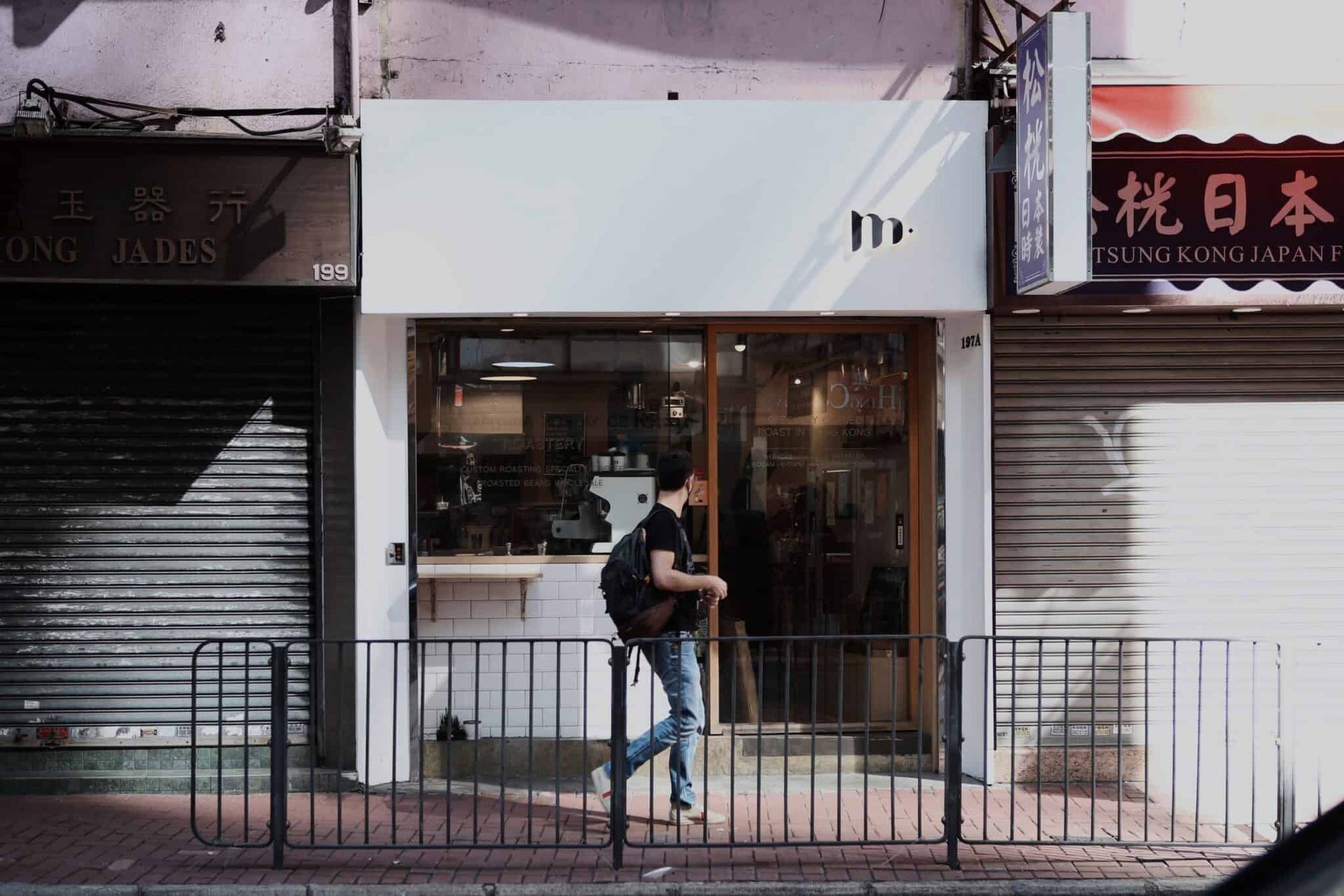
The Hong Kong-based M. Patisserie believes cake is the keeper of special moments. With M standing for Memorable, M. Patisserie joins in celebrating customers’ dear memories by combining cake with art. Recently, M. Roastery has been developed to share divine coffee with home-roasted beans.

Design Solution

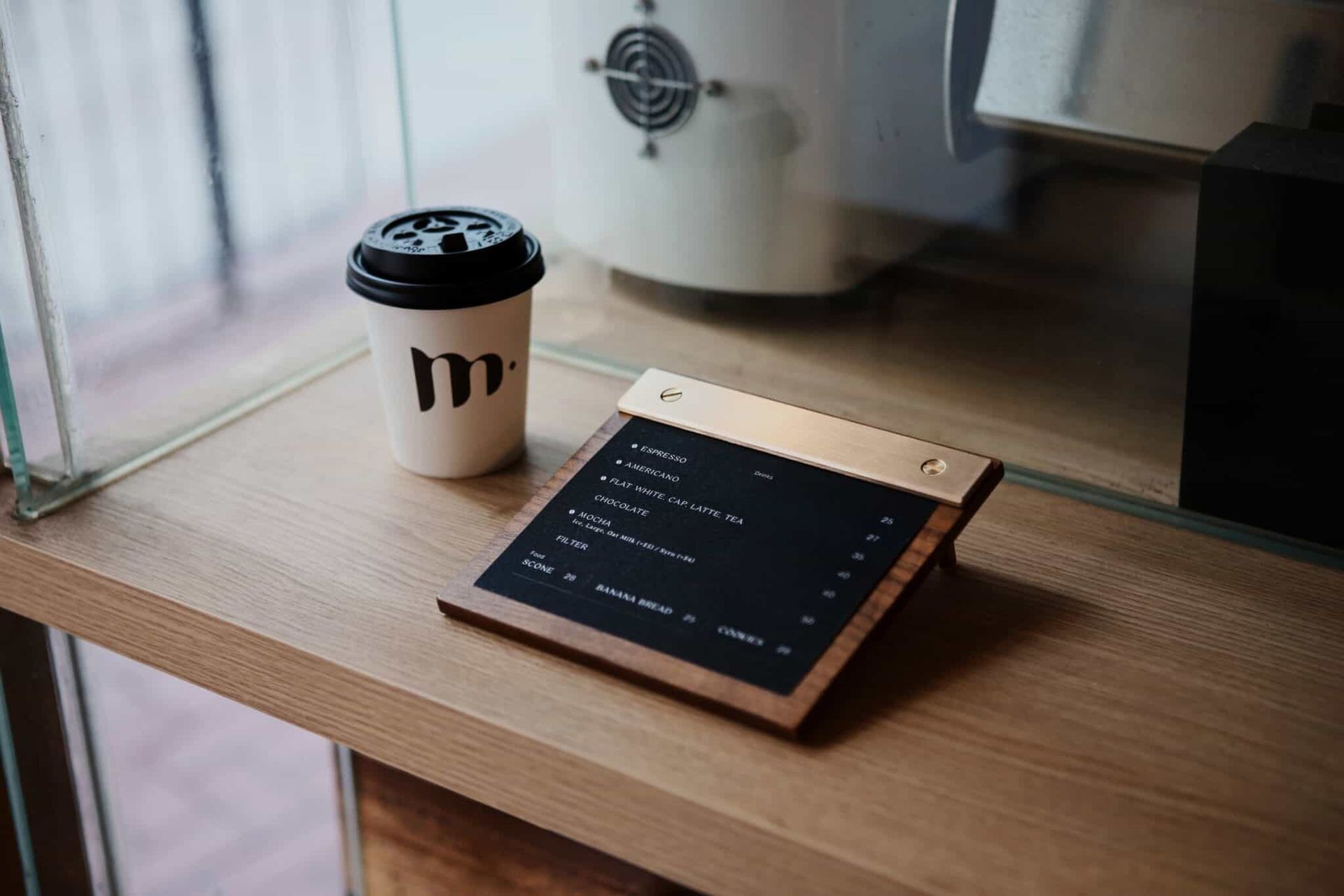
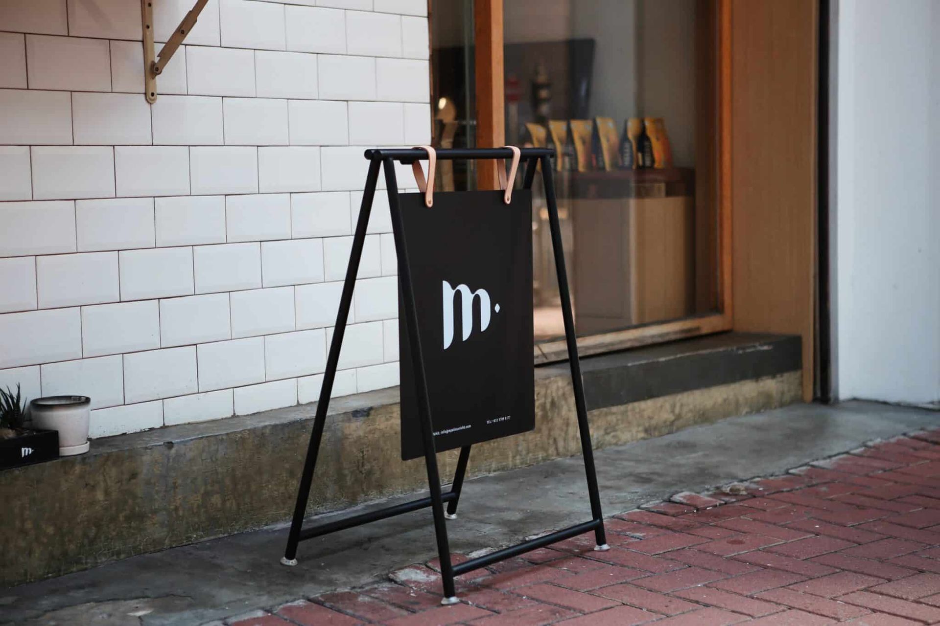
To portray M. Patisserie’s international and professional branding image, Vincdesign extracted the brand’s signature element M. to build a visual identity system for her business series.


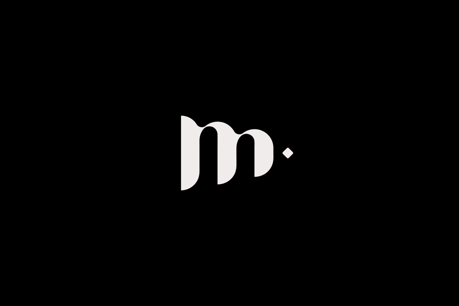
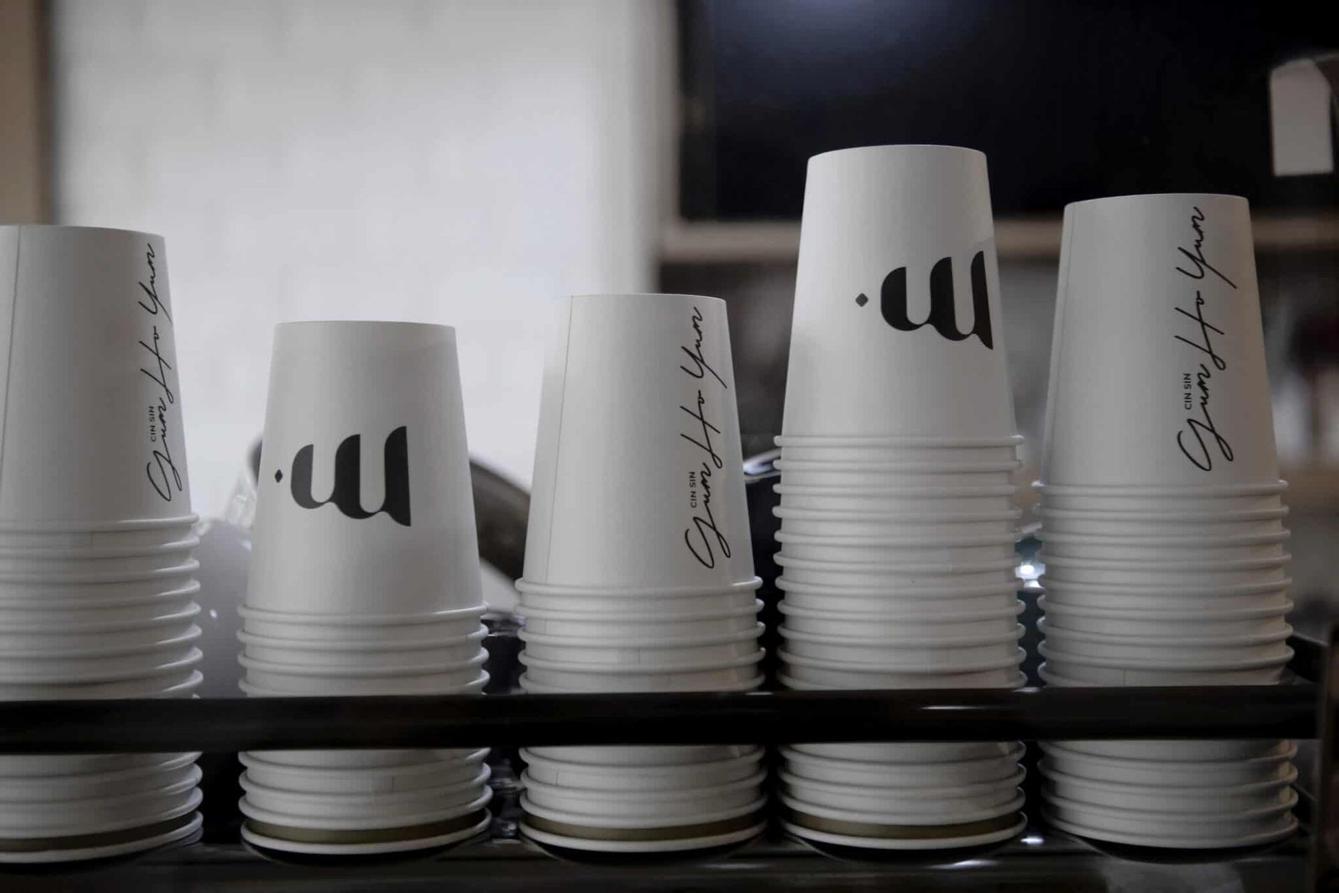
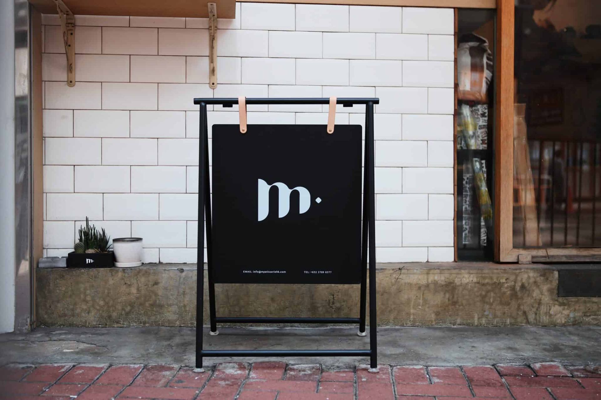
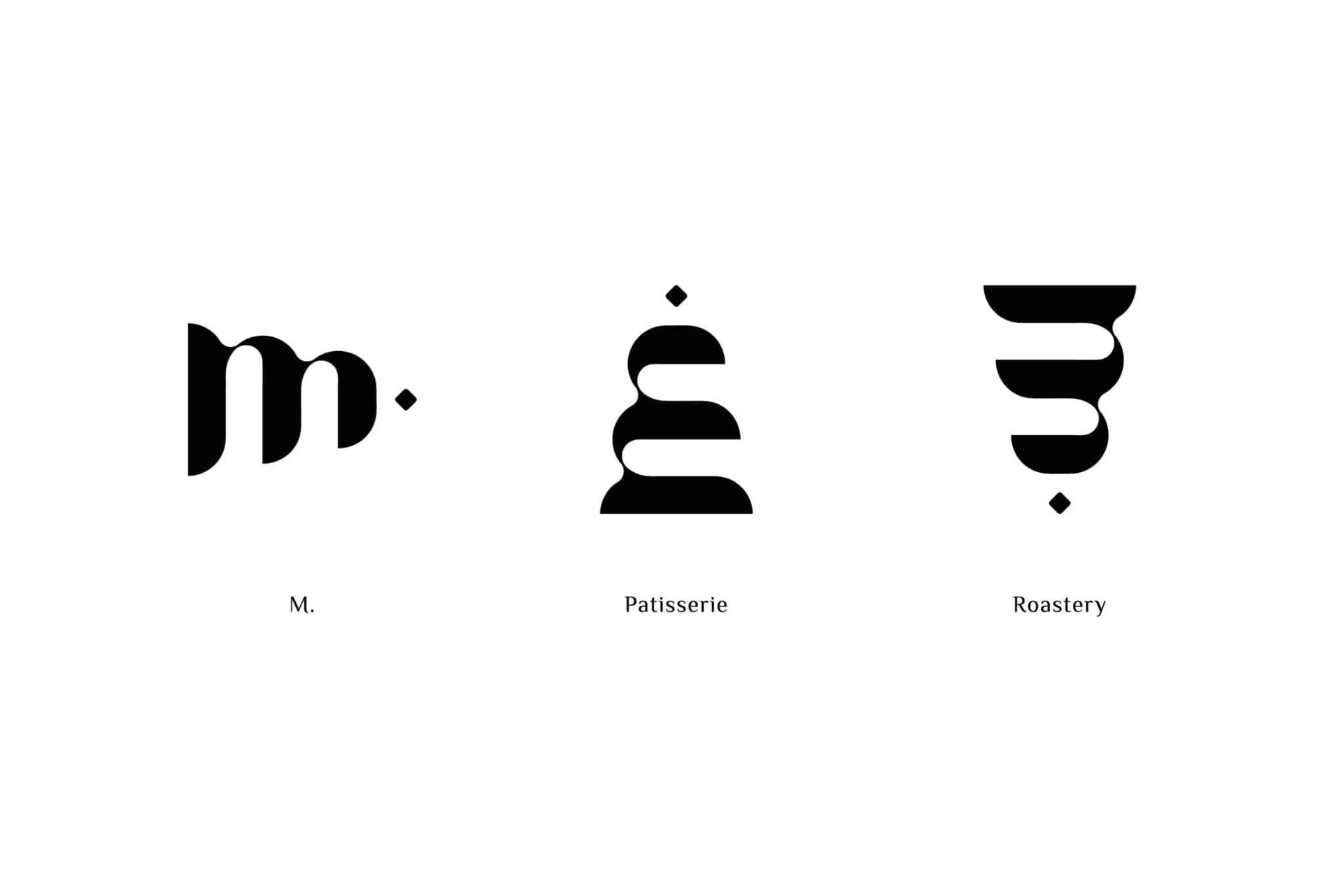
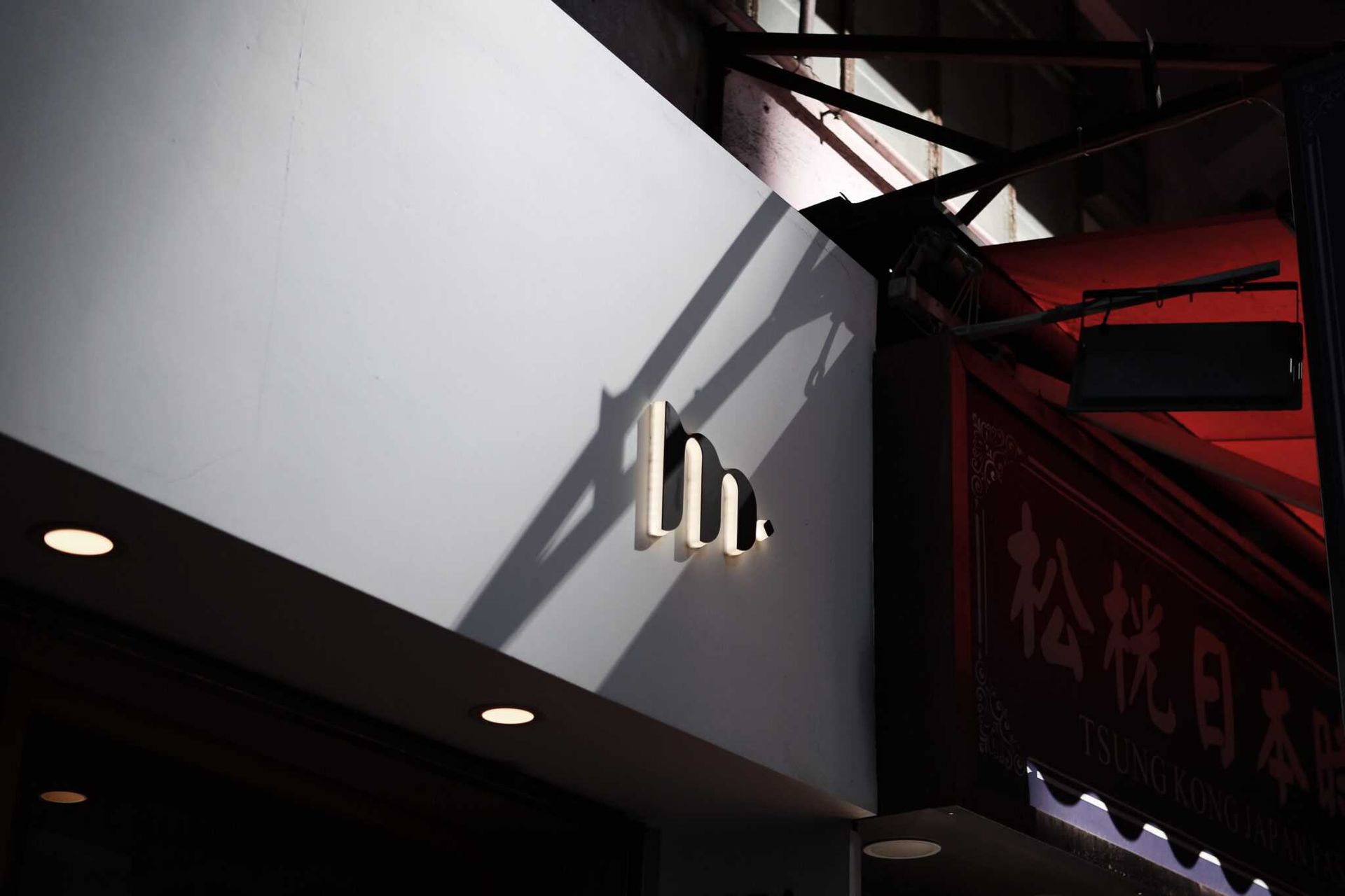
The M stands out from the logo at first glance to represent the founder, Manci Man. And the M becomes a cake when it is rotated 90°, embodying the zest Manci has for cake art. Captivatingly, a W appears when the M is rotated for another 90°, symbolising the incredible woman power Manci devoted to actualise her dream business. One final interpretation is the M’s resemblance with coffee beans, emphasising that a cup of cozy coffee is all it takes to connect and bond.


The logo of M. Patisserie is not completed without that dot next to the letter M. It represents Manci’s promise to make a contribution back to society. Once a youth of the girls’ home, Manci yearns to give back to the community and resolve the world’s needs at her best.


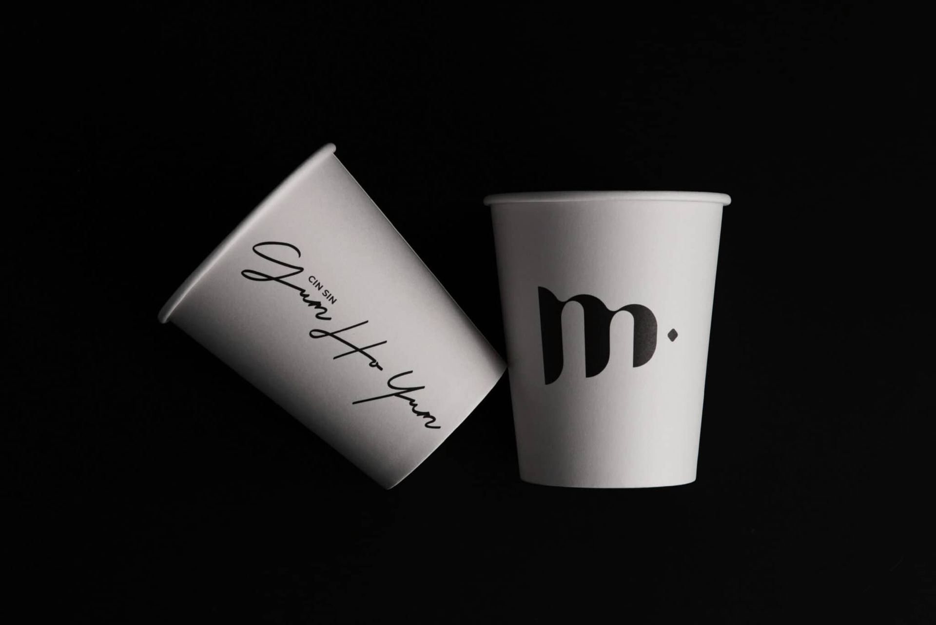
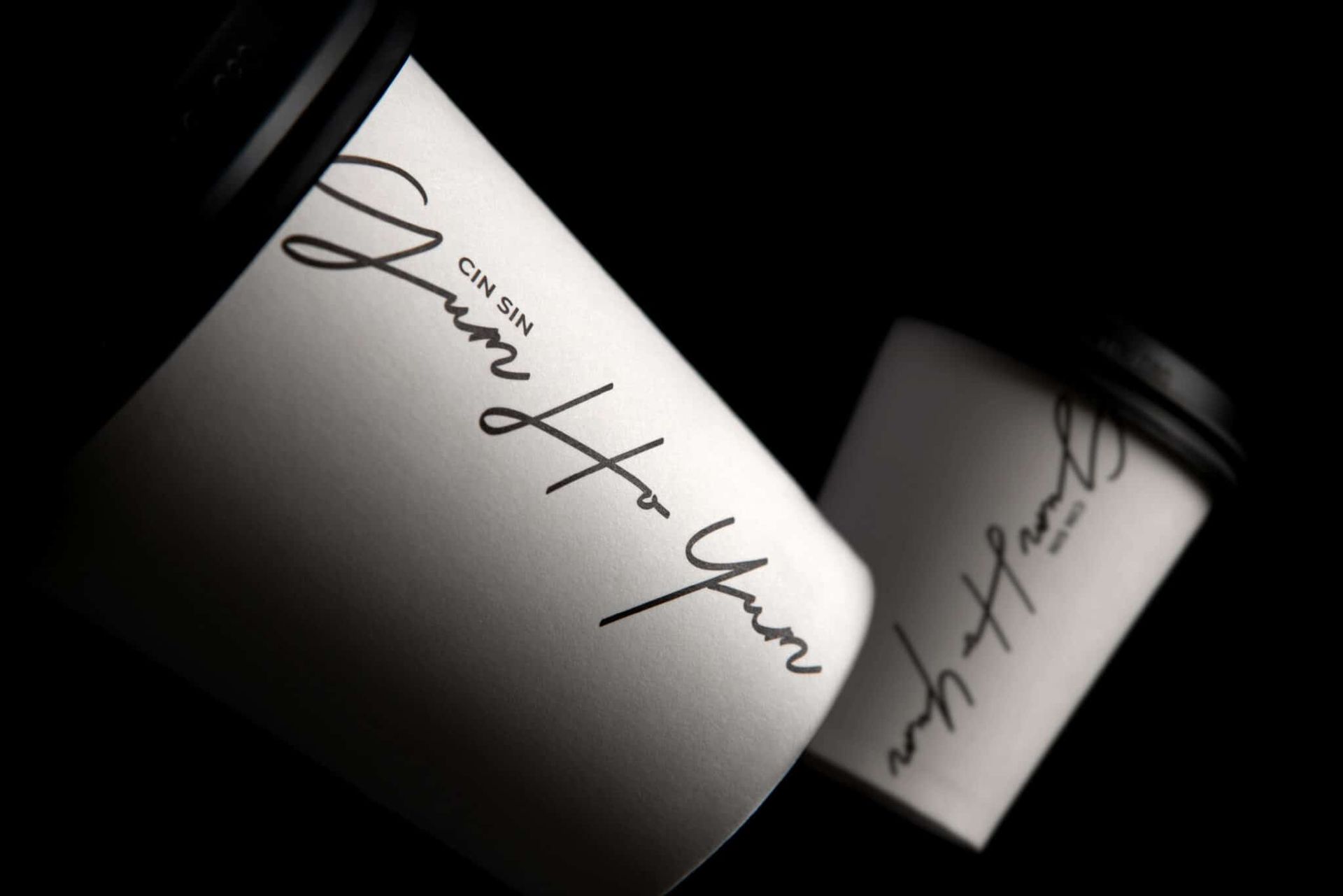
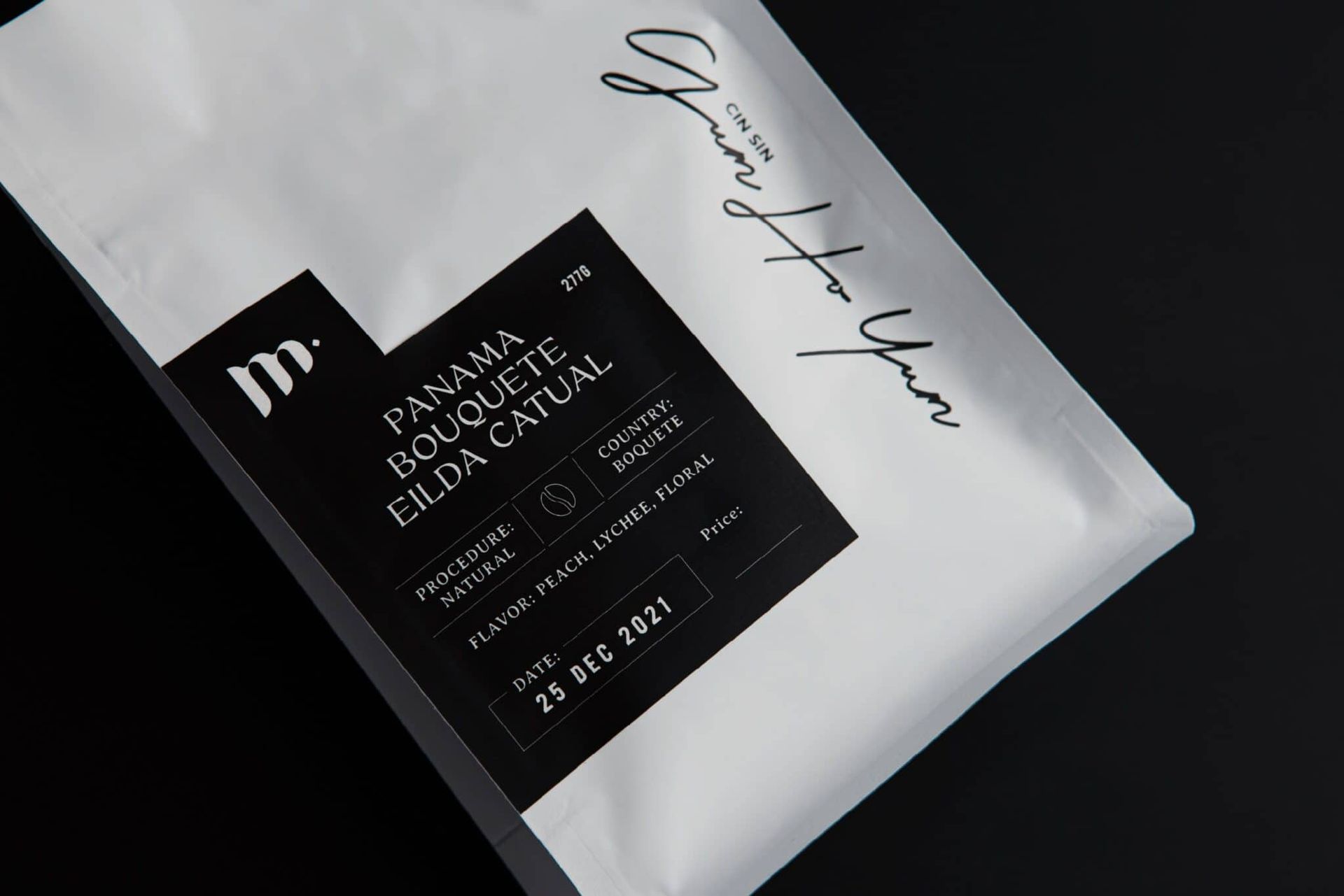
Lastly, the visual identity of M. Patisserie is topped off with the timeless black-and-white brand colour combination. All in all, the elegant and professional brand image of M. Patisserie is ready, ding!
BRAND BACKGROUND

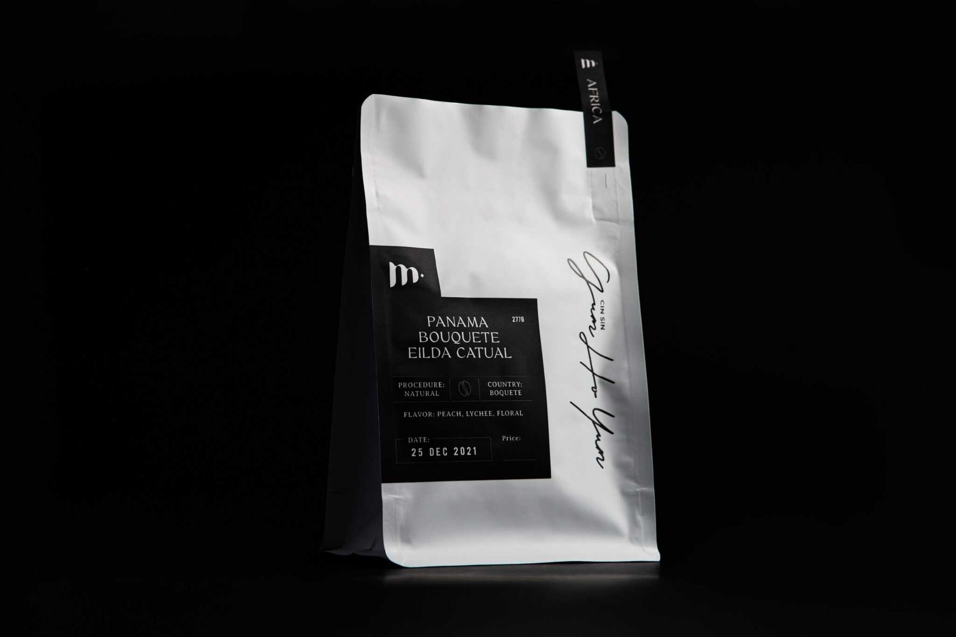
The Hong Kong-based M. Patisserie believes cake is the keeper of special moments. With M standing for Memorable, M. Patisserie joins in celebrating customers’ dear memories by combining cake with art. Recently, M. Roastery has been developed to share divine coffee with home-roasted beans.

DESIGN SOLUTION

To portray M. Patisserie’s international and professional brand image, Vincdesign extracted the brand’s signature element M. to build a visual identity system for her business series.


The M stands out from the logo at first glance to represent the founder, Manci Man. And the M becomes a cake when it is rotated 90°, embodying the zest Manci has for cake art. Captivatingly, a W appears when the M is rotated for another 90°, symbolising the incredible woman power Manci devoted to actualise her dream business. One final interpretation is the M’s resemblance with coffee beans, emphasising that a cup of cozy coffee is all it takes to connect and bond.


The logo of M. Patisserie is not completed without that dot next to the letter M. It represents Manci’s promise to make a contribution back to society. Once a youth of the girls’ home, Manci yearns to give back to the community and resolve the world’s needs at her best.


Lastly, the visual identity of M. Patisserie is topped off with the timeless black-and-white brand colour combination. All in all, the elegant and professional brand image of M. Patisserie is ready, ding!


WHAT WE DID

Branding Design, Logo Design, Brand Strategy, Brand Positioning, Creative Concept, Brand Identity, Brand Communication, Package Design


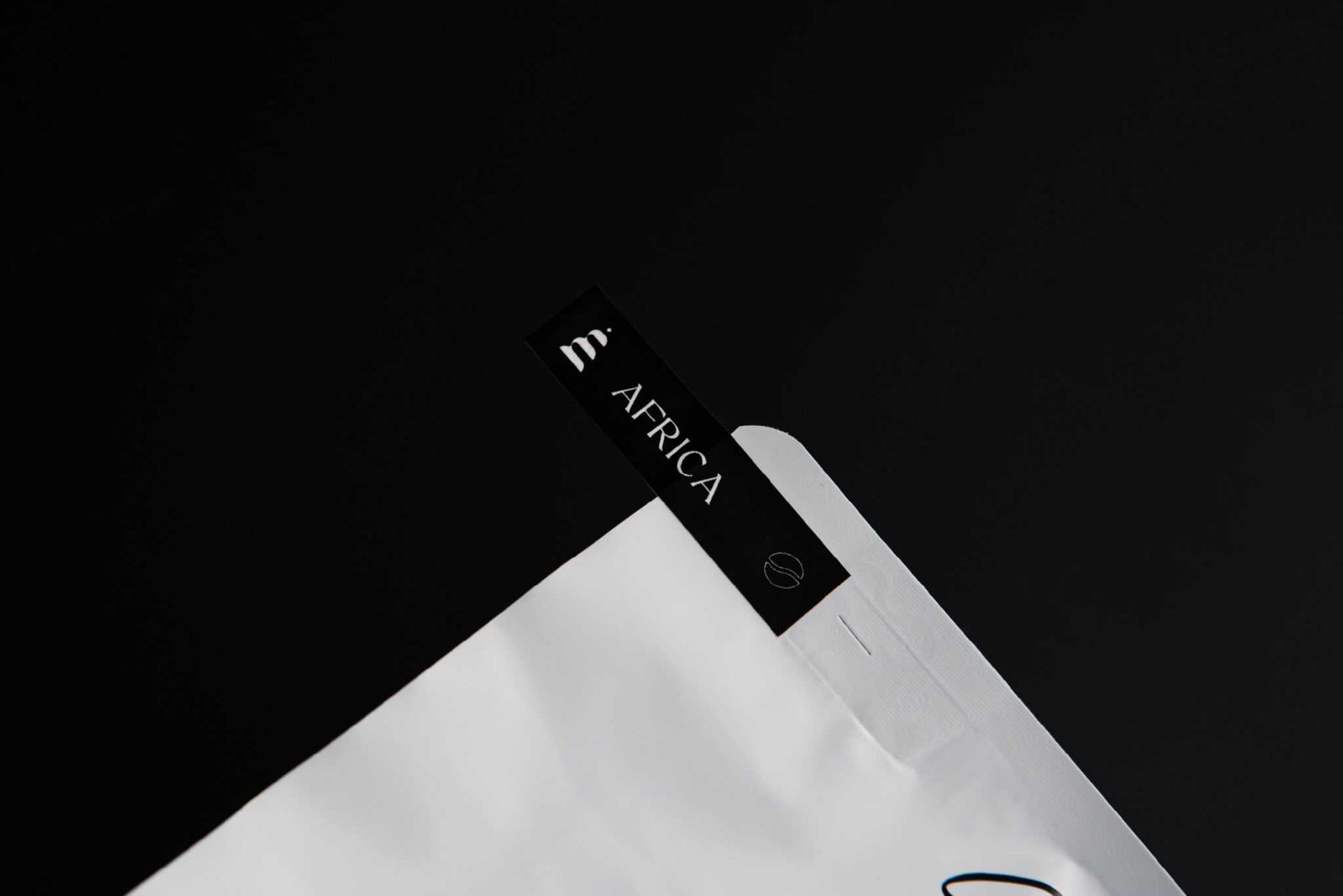
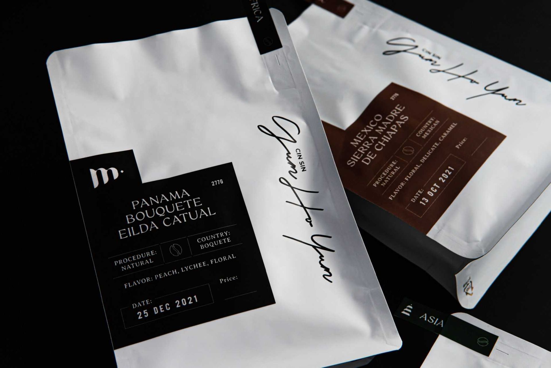
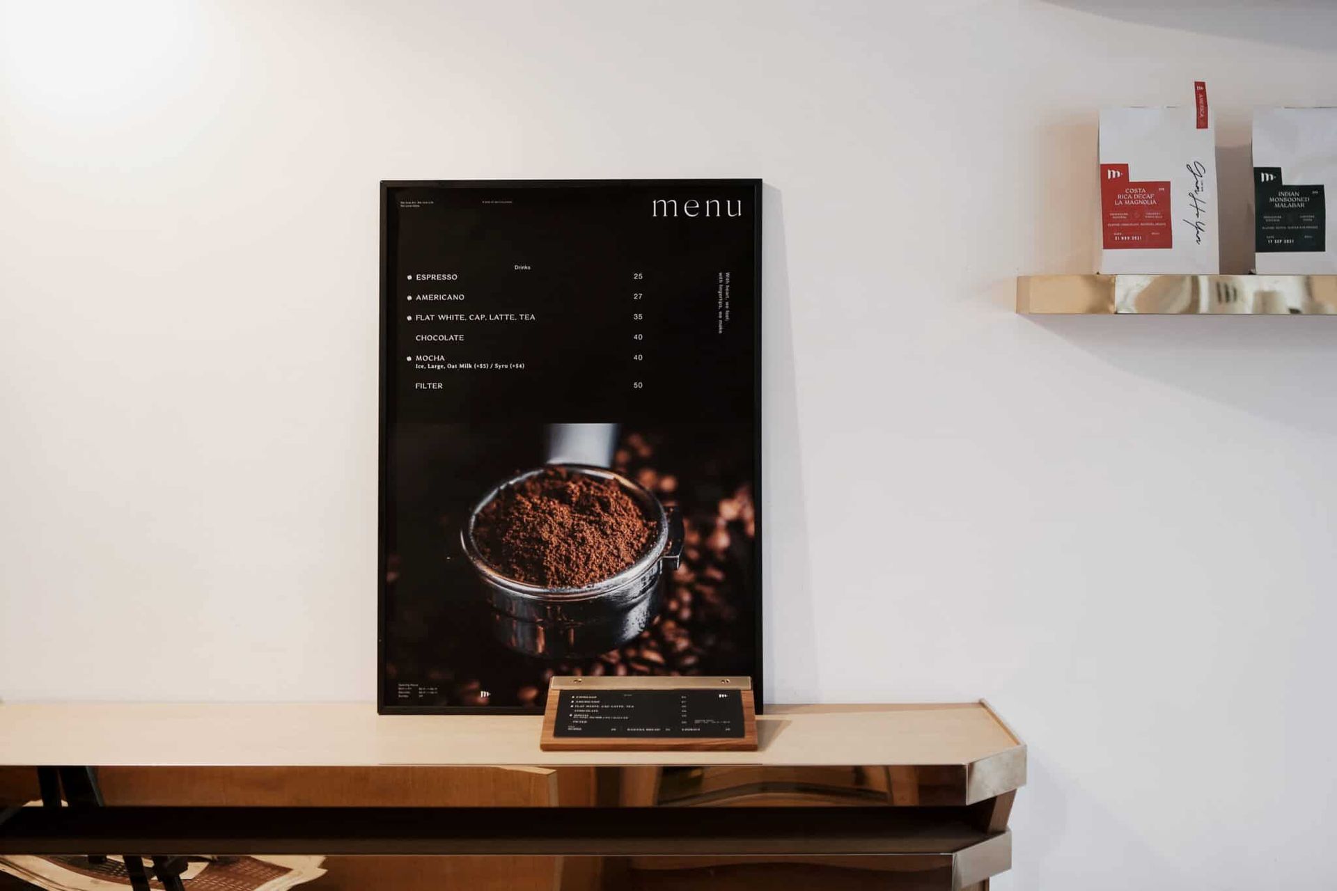
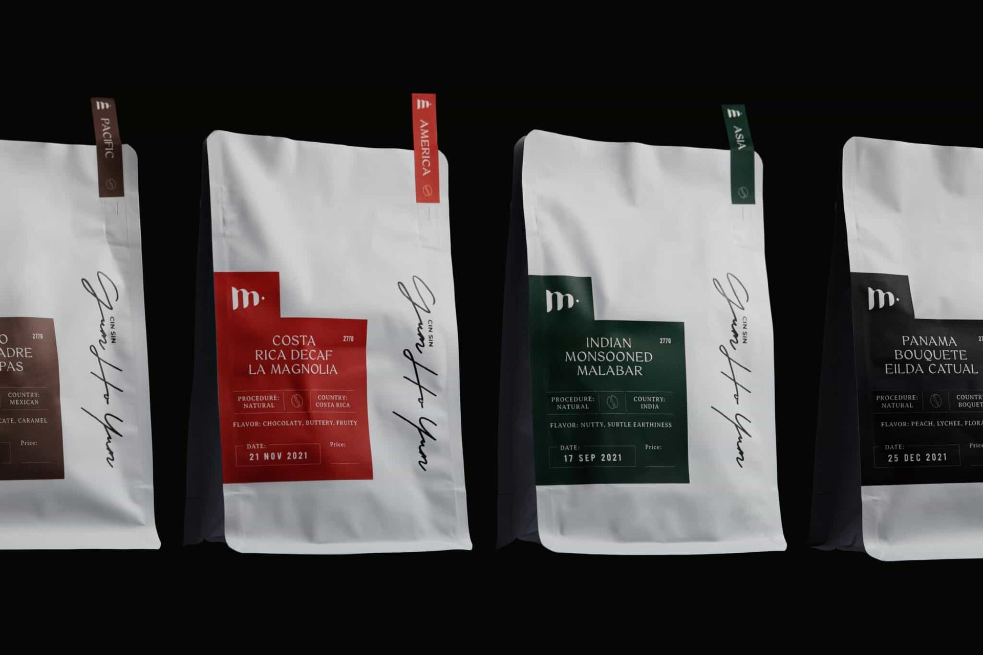
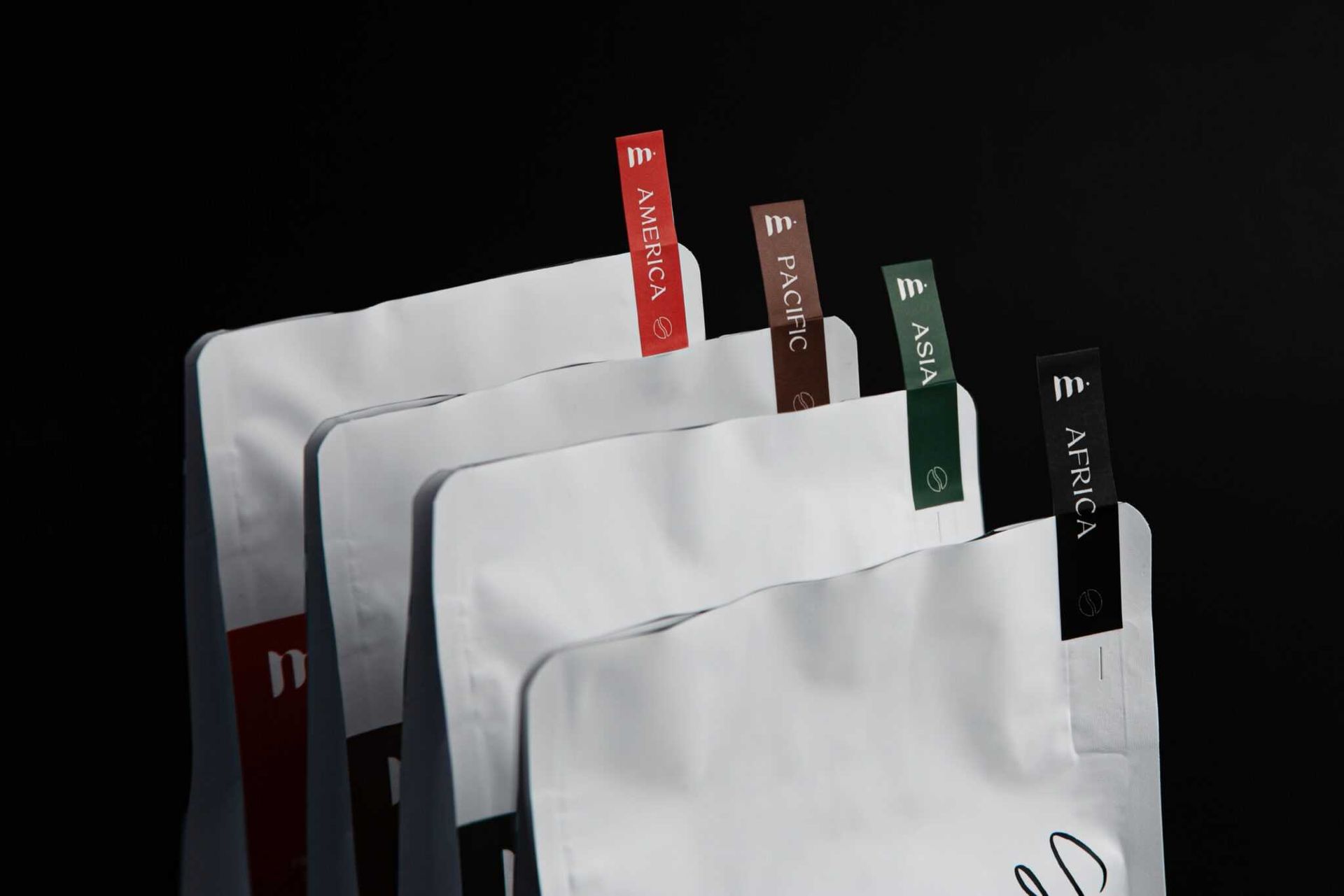
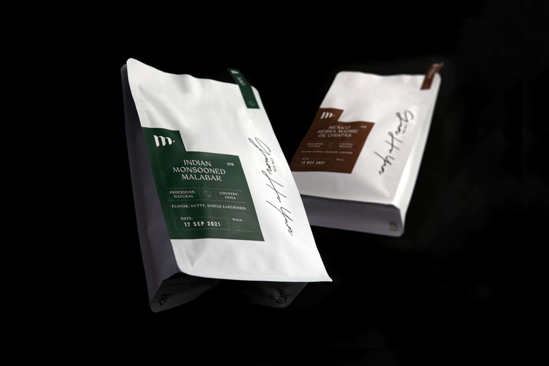
Branding & package design for M. Patisserie / M. Roastery

Client/Project: M. Patisserie / M. Roastery

Creative Director: Vince Cheung

Design and illustration: Kaman Kan

Motion Graphics & Photography: Yin Ip @tinysotiny.co


商標 | 品牌設計 | 香港 | 香港設計 | 視覺形象 | 包裝 | 包裝設計

logo | branding | design | hong kong | hong kong designer | VI | visual identity | vincdesign | package | package design